Have you ever been amazed by the rich, vibrant, almost breathing colors in Oil Pastel artworks? Maybe you’ve always thought that only experienced artists could handle this seemingly complex medium. But here’s some great news: oil pastels are actually one of the easiest and most rewarding art materials for beginners to start with. Unlike oil paints, which require complex mixing, or sketching, which demands precise control, oil pastels let you feel the joy of creation directly with your hands, offering captivating color right from the very first mark.
Why Choose Oil Pastels? Understanding the Unique Appeal of This Medium
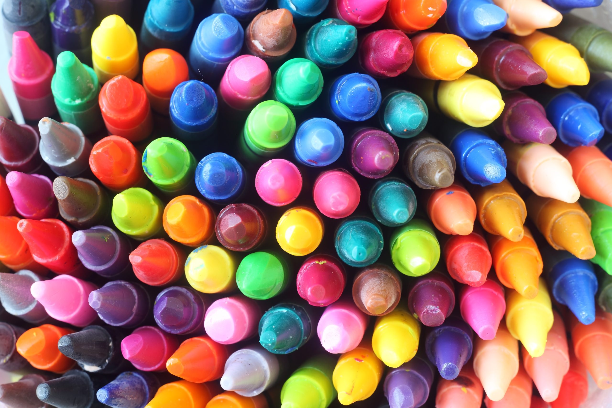
When you first open a box of oil pastels, you’re greeted by a whole range of jewel-toned colors. This magical material, sitting between crayons and soft pastels, has inclusivity as its greatest strength. It doesn’t have the strict water control demands of watercolors, nor does it dry too quickly like acrylics, leaving you scrambling. Oil pastels allow you to think slowly, make repeated adjustments, and even re-blend colors with your finger days later. This flexibility makes the creative process relaxed and free, perfectly suited for newcomers still exploring their personal style.
Many beginners often ask: “What’s the difference between oil pastels and regular crayons?” That’s an excellent question. While they might look similar, oil pastels contain a higher ratio of quality pigment and a small amount of oil binder, giving them far superior color saturation and blending capability compared to ordinary crayons. You don’t need any complicated tools; using just your fingers, you can create soft gradients. If you want to add texture, an old kitchen knife can help you scrape fine lines.
A Smart Start: How to Choose the Right Oil Pastels and Paper for Beginners
Faced with a dazzling array of brands on the market, how should a beginner choose? Our advice is: you don’t need to invest in expensive professional sets right away. In fact, some mid-range brands like Pentel, Cray-Pas, or Paul Rubens offer beginner sets that provide a very good experience. The key is to feel the pastel’s texture – it should be smooth but not greasy, gliding on the paper to deposit a full layer of color, without feeling like you’re struggling with hard wax.
When selecting colors, a 24-piece set is an ideal starting point. This number is enough for you to explore basic color mixing without getting confused by too many similar shades. As your skills improve, you can gradually add individual replacement pastels. Remember, a good set of pastels should let you focus on creating, not fighting with your materials.
Choosing the right paper is equally important, as it directly affects your creative experience and the final result. Unlike standard printer paper, paper designed specifically for pastels has a subtle texture (called “tooth”). These tiny grooves better grip the pigment particles. Canson Mi-Teintes or the Strathmore 400 series are excellent choices; they are affordable and have a texture robust enough to handle multiple layers. If you only have a sketchbook handy, don’t worry – just make sure the paper weight is at least 120gsm to avoid the oil seeping through to the back.
Starting from Scratch: Master 5 Core Oil Pastel Techniques
Now that you have your materials ready, it’s time to explore the magical world of oil pastels. Here are five core techniques every beginner should master; they will open up endless creative possibilities for you:
Layering: Don’t try to achieve the final effect in one step. Start by lightly applying a base layer, then gradually build up intensity with the same or different colors. This “thin to thick” method allows for precise color control and is easier to adjust if you’re not satisfied.
Finger Blending: This is one of the most enchanting features of oil pastels. Choose two or three adjacent colors (e.g., light blue, sky blue, and navy), apply them to the paper, and then gently blend them in a circular motion with your fingertip. You’ll be amazed at how they naturally merge into a delicate gradient.
Scumbling & Sgraffito: Apply a light color loosely over a dried darker layer to create a broken color effect. For fine details like hair, grass blades, or starlight, use the sgraffito technique: gently scratch into a dried layer with a toothpick or blunt knife to reveal the color or white paper underneath.
Color Mixing: Try layering semi-transparent colors over one another to create optical mixes. For example, lightly applying blue over yellow will yield a vibrant green, often more lively than using green directly from the set.
Using Solvents: Want a watercolor-like effect? Use a brush dipped in a small amount of odorless mineral spirits or a dedicated blending solution to gently brush over your pastel marks. This advanced technique can create fascinating transparent textures, but beginners can first get comfortable with the previous four methods.
Your First Artwork: A Step-by-Step Simple Landscape Painting
Enough theory—let’s create your first complete artwork! This step-by-step guide will walk you through drawing a simple sunset landscape, practicing all the techniques you’ve just learned:
Step 1: Light Sketching
Use a light gray or ochre pastel to lightly sketch the basic composition. Draw a horizon line to separate the sky and ground, adding a few simple shapes for distant mountains and trees. Remember: these are just guide lines and will be covered later, so keep your pressure light.Step 2: Blocking In the Sky
Start with the warm tones of sunset. Fill the upper sky with yellow, use orange for the middle, and transition to pink near the horizon. Don’t worry about stark lines between colors at this stage; we’ll handle them next.Step 3: Blending the Gradient
Now use the finger blending technique we practiced. Gently smudge the color boundaries with horizontal motions. The goal is to create a smooth transition from yellow to orange to pink. Enjoy the feeling of the colors merging under your fingertips.Step 4: Building the Ground
Choose a deep purple or indigo blue for the foreground land. Use the side of the pastel to apply color broadly, creating a cool area that contrasts interestingly with the warm sky. This is a great time to use the layering technique – start with a thin layer, and deepen it once you’re happy.Step 5: Adding Silhouettes
Use black or dark brown to draw silhouettes of trees, bushes, or buildings. Here you can try the sgraffito technique: once the dark layer has set a bit, scratch fine lines to represent branches or power lines, revealing the warm sky color beneath.Step 6: Final Adjustments
Step back and observe the overall effect. Do any areas need strengthening? Perhaps the sky needs more pink, or the foreground could use a few strokes of light purple to show reflection. Remember: creation is a dialogue between you and the artwork; there are no absolute rights or wrongs.
Path to Improvement: Avoid These Common Beginner Mistakes
As you practice more, you’ll develop your personal style. In the meantime, being mindful of these common pitfalls will help you improve faster:
Over-blending: Finger blending is fascinating, but excessive smudging can make colors look muddy. Learn when to stop, preserving the textural quality of the strokes in some areas.
Fear of White Space: Unlike sketching, leaving some of the paper’s original color visible in an oil pastel piece is often an intentional design choice. These areas of white space give the artwork room to breathe and enhance the sense of light.
Neglecting Preservation: Finished pieces need proper protection. Simple fixing methods include lightly spraying with a fixative spray designed for oil pastels, or using spacers to frame the artwork so the glass doesn’t touch the surface.
Comparison Anxiety: Remember, every artist is on their own journey. Your first piece might not be as perfect as you imagined, but that’s part of the growth process. Every drawing is an important step towards creating better work.
The world of oil pastels is full of surprises and possibilities. It’s suitable for a quick ten-minute sketch as well as worthy of hours spent on a carefully crafted piece. Most importantly, maintain an experimental spirit and enjoy the pleasure of colors dancing at your fingertips. Now, your artistic adventure awaits – pick up the color that catches your eye and make your first bold mark on the paper